

[caption id="attachment_9811" align="alignright" width="169"]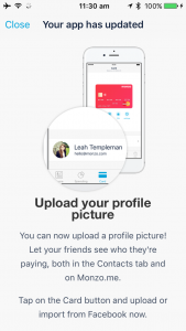 A new function introduction page from Monzo (UK).[/caption]
Most common amongst those approaches is a still or static introduction to a new feature seen in channel, an approach that is deployed by bank's the world over in a variety of channels. For example, in the screenshot opposite you can see one such recent introductory page from the Monzo (UK) mobile banking app on the iPhone which, in this case, was introducing new functionality that allows customers to upload a profile image.
But how do banks engage with customers around existing functionality, or assist them in seeing and accessing the features they are looking for in the fastest possible manner?
In short, there are a mix of approaches that do (and don't) work, and today we are going to focus on three - the common theme amongst them being that the banks in question are seeking to guide the customer towards the functionality rather than simply explain where it resides.
Perhaps foremost amongst its peers is the 'Show Me How To' functionality deployed by Lloyds (UK) and its partner institution Halifax (UK) in the respective desktop web channels. Each bank provides eleven different customer journeys, that will ferry the customer from wherever they are in the channel to the functionality they are looking for. As readers will note in the demonstration videos below, these elements of functionality cover a range of everyday interactions and make for a very straightforward 'help' experience. To date, these two banks are the only two that we have seen offering this type of help experience to customers in any digital banking channel.
Another approach has been to a 'Helpful Redirect' wherein the bank allows the customer to search through help menus, and amongst the options typically provide a link to the functionality in question. Examples from the Bank of America (US) desktop web channel and the Commonwealth Bank's (AU) iPhone app are shown below. Notably, both of these banks also provide similar functionality in other channels.
Finally, there is the banks that operate as 'Tour' providers, where they offer customers the opportunity to follow a bank or customer initiated tour to understand the use of functionality. Examples below are taken from Westpac's (AU) iPad app wherein the bank provides an always present tour option on the account summary screen, and Chase's (US) desktop web channel, wherein customers can navigate to a help and support menu in order to access tour option. Again, these experiences can be seen in video below.
A variety of options, from a variety of banking providers, each of which is seeking to enhance the customer experience by providing a bridge between them and the functionality they are seeking to access. Let us know which approach you think works best in the comments below.
See more with iSky Research.